Woo graphics two.
For the project I redesigned Quimby's bookstore.
Check out the website...
Here's the address. Just in case.
people.ku.edu/~sam1712/quimbys/home.html
Wednesday, September 30, 2009
Tuesday, April 28, 2009
type ii #15
So this vid was very interesting i would say. the shock of how fast our world is moving is what i guess i can say took me off guard. we are traveling so fast through life and the technological advances that we have made. i wasn't really sure if it was recent but at the end when it mentioned 2008 i satisfied.
http://www.youtube.com/watch?v=nteiqLgZFOU
http://www.youtube.com/watch?v=nteiqLgZFOU
Tuesday, April 21, 2009
type ii #14
The part about remix was really cool. I think it is very true that that is how we as "young" people think. we think to change and how we can make it our own. it also says something about how customization is such a big part of our culture today. everything has to be "ours," remixing is a very good example of how that need for customization is fulfilled.
Dancing Jesus...Yes.
Larry Lessig
Dancing Jesus...Yes.
Larry Lessig
Thursday, April 16, 2009
type ii - my vid so far
So here is my type video so far. I changed some things...its not done obviously.
Give me some feedback and please spell check for me...i've been looking at it too long to notice some errors...
Give me some feedback and please spell check for me...i've been looking at it too long to notice some errors...
Tuesday, April 14, 2009
type ii #13

The letters created out of buildings was really cool. With a bit of cropping i guess anything can be made into typography. With buildings being so common i am surprised no one has noticed it before...maybe they were looking at the negative space but not necessarily what it could create.

My favorite use of type in these images and the others on the website is the "pull" door handle. i think it's a clever way of using type when it is a necessity.
Sunday, April 12, 2009
type ii #12
Debbie Millman is an internet talk show host who interviews lots of designers...usually famous ones...
Design Matters is the show in which her interviews take place.
I chose to listen to the Ed Fella interview...
i found it interesting that Fella doesn't use the computer to do his work. he uses drawing tools. it was odd that his only reason he vocalized as to why he doesn't use a computer is because he doesn't know how and it would take too long to learn. he feels he is paralleling work on the computer and he's been trained so he might as well use what he knows.
i didn't really like the show. it was boring. maybe i just didn't listen to the right interviews but Millman's voice annoys me a bit.
Design Matters with Debbie Millman
Tuesday, March 31, 2009
type ii #11
Laws of simplicity...
reduce - be thoughtful about what you take away
organization - if done right a lot looks like a few
differences - simplicity needs complexity
emotion - the more the better
failure - if its just not meant to be simple then let it be complex
the one - take away the obvious and add the meaningful
I agreed with the laws. If I didn't agree with a certain law it was somehow addressed later as an exception. All of the laws up until the failure law only deal with simple but the failure law recognizes the fact that not everything can be simple. He definitely took the time to really think about all of the laws individually and as a group.
Thursday, March 26, 2009
type ii speech questions
who is speaking?
Malcolm X
why was this speech important?
It is talking about the relationship between white and black people and how they should be aware of each other and because of that awareness the success that can come from it.
why do i find it interesting?
not only do i think the content reflected an interesting opinion about civil rights i like the way he talks.
what is the emotion/mode/tone/feeling/personality of the speech?
It is passionate but very direct. It has a serious tone and has a conversation feeling. Like he's talking to someone not to an audience.
what is loud/stressed/soft/paused/emphasized?
The words "white people" and the vices that he lists. At the ending there is a lot of emphasis on the words being listed.
how does it make me feel and the audience feel?
Well at the beginning someone laughs but the people listening probably believed completely in what he was saying as if it were a sermon. I think what he was saying was a good solution to the problems that were happening. He was very well spoken and it is reflected in the speech.
bio of malcolm x...
African American civil rights leader Malcolm X was a major twentieth-century spokesman for black nationalism. Unlike many other African American leaders of this time, who supported nonviolent methods, Malcolm X believed in using more aggressive measures in the fight for civil rights.
Tuesday, March 24, 2009
type ii #10
Good.is...i watched a bunch of videos but my favorite was the Happy Meal vid. It was funny because it played obviously on the McDonalds happy meal but it took a closer look at a moody cow name sonja...and her owner. How they treated telling it was GOOD was cool too and different from the rest of their videos.
Stop Stealing Sheep and find out how type works
1: Type is everywhere
Type is around us everywhere on signs, posters, walls, books. It is used to communicate different things and when you really look at it people rely on type to find their way around more than you may realize. Because type is such a large part of our lives it is important that it is designed properly.
2: What is type
Over the years the forms of type have changed but they always have a foundation that was created back when it was first invented. The way type is created has also changed over the years.
3: Looking at type
Typefaces have different appearances and styles to them for a reason and people understand which typeface works better with something.
4: Type with a purpose
Certain typefaces work better to get a message across than others. For example, business text should look serious and organized.
5: Type builds character
A designer should understand and know the little details about their project or text. By knowing their work thoroughly they will be able to choose the appropriate typeface.
6: Types of type
Being able to see the characteristics of a typeface and understand the distinctions from one to the other can make a designer's job easier when it comes to choosing one for their project.
7: How it works
Adjusting the leading and kerning of in a body of text can only do so much. Some typefaces are meant for smaller sections of text while others are meant for a longer body of text.
8: Putting it to work
Designing an effective layout can result in following the rules of placement. Placing text in an organized yet dynamic way can keep the viewer engaged in the work as well as get the message across.
9: There is no bad type
Type changes over time in order to stay "in" and not out-dated it relies on the trends in society. What is acceptable today may not have been 20 years ago but just because it is different, more expressive, or "ugly" to some does not mean it isn't effective.
type ii #9
Animated typography is...putting characters and letters in motion. Sound was a key tool in the success of the video examples. I felt the ones that had sound were definitely more effective. As long as the sound is relevant to the the words it overall improves the message.
Tuesday, March 3, 2009
type ii #8
Steven Heller seems like some old man that can't open his mind up to the possibility of new design. The article Cult of the Ugly bashes young designers and the direction that they are taking the industry. The standard design practices are still out there, people are still following Paul Rand religiously but some want to stray. Heller thinks they are just playing around...and they are... and they can. They still students. And they know the rules well enough to break them. Steven Heller is old.
Sunday, February 22, 2009
type ii #7
Writing is important to design. You go through a similar process writing and designing. Writing well can enhance your design merely by the fact that you can articulate what it is and means better. Understanding writing and how to do it well will help you if you end up designing something with a lot of writing in it or if you have to create the content for what you are designing. Basically, you need to know how to write.
type ii #6
I read Michael Beirut's Designing Under the Influence and Authenticity: A User's Guide
I could see how he expected a design student to know a famous designer and to know that that their work resembled that famous designer. But to the extent that he was angry or confused I don't agree with. When you are going through your education in design it is very good to know other designers and the "famous" ones that have had great influence on graphic design, but with all the new young designers showing up and creating new things it is sometimes hard to look back. Even when you look at design history how do you define who was a "great," there is so much out there and in history. With views changing so much a certain designer that was once thought to be great could be overlooked because another great in favor now.
In the second article he almost contradicts what he was talking about in the other. How designers love imitation and simulating things is natural in the profession. That is odd when in the previous article he was so taken back that some girl had something that resembled someone else's work.
Thursday, February 12, 2009
type ii #5
I found Stefan Sagmeister's video pretty interesting. He talked a lot about other people...I wish he would have talked about his stuff more because it is good. The subway signs were interesting. I wouldn't pay that much attention to a sign...in a subway...maybe I will...if I go to a subway.
type ii #4
Ten commandments...from Type Heresy
1. Thou shalt not apply more than three typefaces in a document.
2. Thou shalt lay headlines large and at the top of a page.
3. Thou shalt employ no other type size than 8pt to 10pt for body copy.
4. Remember that a typeface that is not legible is not truly a typeface.
5. Honour thy kerning, so that white space becomes visually equalized between characters.
6. Thou shalt lay stress discreetly upon elements within text.
7. Thou shalt not use only capitals when setting vast body copy.
8. Thou shalt always align letters and words on a baseline.
9. Thou shalt use flush-left, ragged-right alignment.
10. Thou shalt not make lines too short or too long.
Going to Hell...
1. Break the letters imposed by the use of only three typefaces.
2. Let thine eyes be seduced by the hierarchy of type.
3. Do not forsake smaller or bigger sizes.
4. Be seduced into trying new and expressive typefaces.
5. Treat kerning and tracking with total irreverence.
6. Entice the reader to sample the delights of your text.
7. Do not forgo the liberal use of capitals within your text.
8. The Lord designed letterforms to stand side by side, but there is no harm in their being lured away from one another.
9. Yield to the temptation to align text in unusual ways.
10. Lure the reader down unfamiliar paths.
Tuesday, February 3, 2009
type ii #3
After watching the videos what took from it were some nice ideas about how to reach people through your work. He, in the first video mentioned participation. Not necessarily interactive but something to get the viewers mind to work, so the viewer has a "personal discovery".
-"Be inspired.
Tell stories.
And leave things out."
In the third video he talked about when you are designing and trying to tell the story you've come up with make sure it is something that everyone can relate to. You have to learn how to tell stories and to do that you have to have practice...by doing it. Try writing a song or a short story of your own just for practice.
Monday, February 2, 2009
type ii #2

Bruce Mau is from Canada. He studied at the Ontario College of Art and Design. He is the founder of Institute Without Boundaries and the creative director of Bruce Mau Design. He didn't graduate from the Ontario school but left early to join the Fifty Fingers design group. He designed the Zone 1/2 and then started his own design studio and kept designing the Zone books. As of 2007, Mau was in residence at The School of the Art Institute of Chicago, in the Architecture, Interior Architecture, and Design Objects Department.
Make mistakes faster.This isn’t my idea -- I borrowed it. I think it belongs to Andy Grove.
Once you make a mistake you know it is one and can try to improve on it, fix it or just give up on it. But you have to make the mistake to figure out what to do with the idea. If you don't try all those ideas that you think could be a mistake you'll never know and it could've turned out to be a success.
Tuesday, January 20, 2009
graphics reading 2
Everyone realizes the client is important...or you wouldn't have a job in the first place. What I didn't pay enough intention to was the fact that ideas for the project can stem directly from interacting with that client. If you learn as much as possible you can find insight and come up with a great idea that relates the to the client because that's what it was derived from.
Another part of the reading I thought was important was the part about being strong. In that part there was commentary about when your ideas get rejected. I have fallen in love with many of my designs only to have them shot down and buried with no means of revival. It sucked but I had to keep going like the reading said. In the end its not about what you thought was perfect, it's about the joint agreement of what the you and the client decided was best.
Another part of the reading I thought was important was the part about being strong. In that part there was commentary about when your ideas get rejected. I have fallen in love with many of my designs only to have them shot down and buried with no means of revival. It sucked but I had to keep going like the reading said. In the end its not about what you thought was perfect, it's about the joint agreement of what the you and the client decided was best.
Monday, January 19, 2009
graphics reading 1
So much goes into what we interpret from a symbol. It depends on our culture in what context that symbol in is. Even word can mean other things in different contexts. when creating a logo you have to imagine every way that someone can interpret it, every way that someone can look at it differently. After brainstorming and looking at your target audience you also have to look at the audience you aren't trying to reach so that you don't offend them as well or convey the wrong message.
What is the definition of semiotics and how does it apply to creating logos?
What is the definition of semiotics and how does it apply to creating logos?
Sunday, January 18, 2009
type ii


?
?
?
?
kyle kolker
?
?
joya mizeli
?
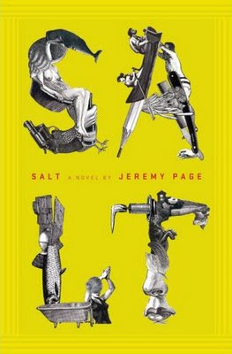
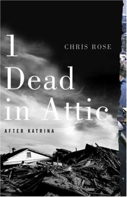
john gall
chip kidd
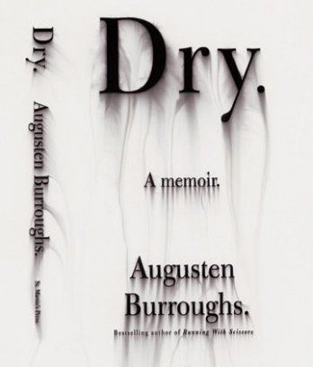
Who is Chip Kidd...
He is a book cover designer.
Why is he important...
He has designed over 1000 book covers. He is a graphic designer turned author and he received the 2007 Cooper-Hewitt National Design Award. He creates unique interesting book designs that seperate themselves from the rest of the book world
He is very good at what he does.
Who is John Gall...
He is the art director for Vintage and Anchor books. He too is a book cover designer.
Why is he important...
He is the art directer the oversees about 200 books a year being designed and publishes. He is a leader in his profession and he is very good at what he does as well.
Definitions...
series - a sequence of books with similar traits or characteristics
sequence - a ordered list of things (i.e. books) that follow one another
sign - a symbol that represents something to inform or communicate with the viewer
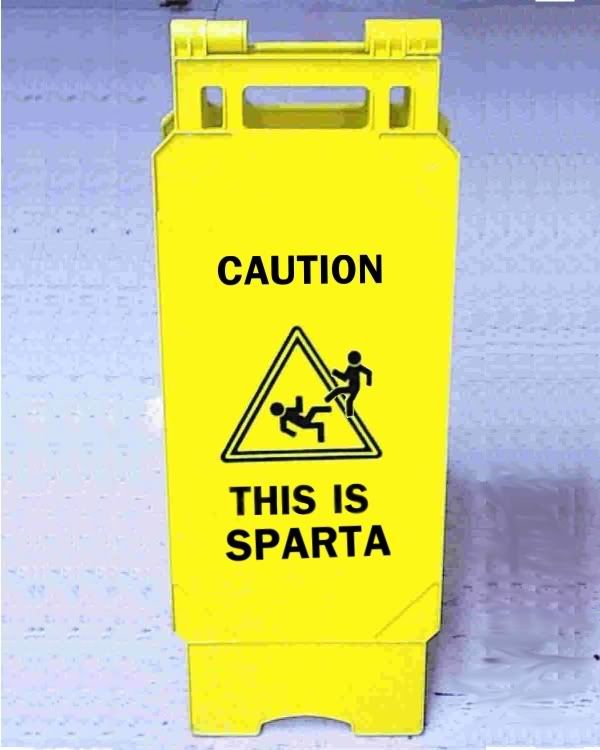 example...this sign is telling we are in sparta...a pedestrian crossing sign or deer crossing sign
index - a sensory feature that correlates to or implies something else
 example... these storm clouds are an index of a storm to come...
smoke is index of a fire
symbol - a picture that represents something or a word that represents some other word
 example... this picture is a symbol for peace...
the six point star is a symbol of Judaism
Subscribe to:
Posts (Atom)