Sunday, September 28, 2008
Question about my history
Tuesday, September 23, 2008
the industrial revolution: a history
The Industrial Revolution was a time of change. Technology was advancing rapidly and the world was changing. A consumer society was created out of the huge advancements in technology that made producing things easier and faster. Factories were constructed as the world moved away from the home businesses. With the new factories and faster produced products advertising was a must in this newly created society.
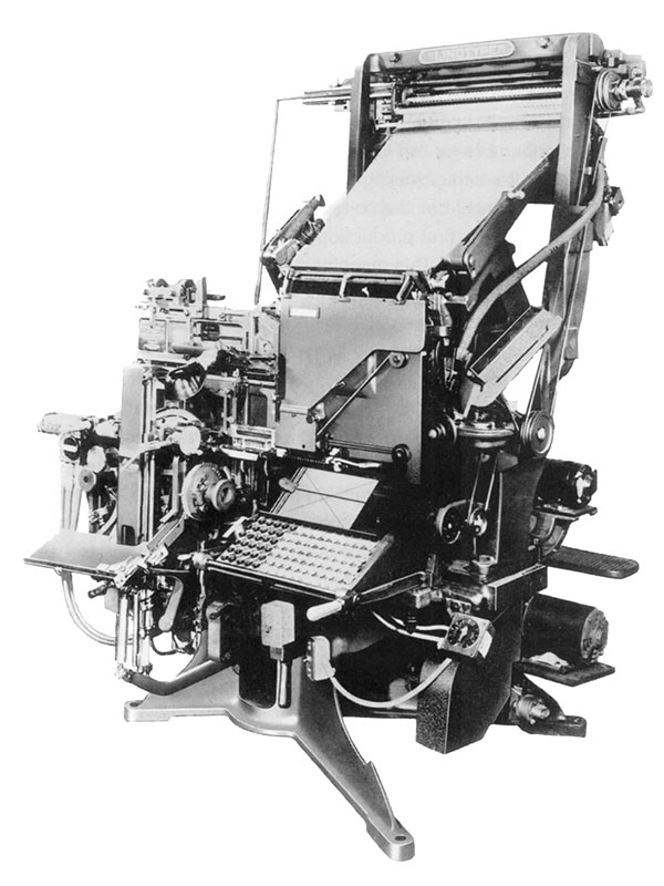
The mechanical side of printing was improved which allowed for speedier printing, line-casting machines, and photo engraving. The line-casting machine allowed for more detail in typesetting. Using points for the measurement of type was also set during the Industrial Revolution.
The creation of new fonts was also sped up because of the advances in technology. More typefaces were developed and adding to existing fonts was easier. Boldface was introduced during this period. With the technology and ease that came with it the experimentation with typefaces began. With the continued experimentation serifs were edited out and disappeared in the typefaces of the time.
William Caslon created the first sans serif font: English Egyptian. The trend of sans serif fonts was called grotesque, a name still used today, because it was so unusual compared to the other fonts of previous eras.
 With the Industrial Revolution also came advances in lithography. Created by
  Alois Senefelder lithography saw refinements that sped up the print speeds dramatically. With the new commercial society the need for posters to advertise things became widespread. Along with the advancements in poster design and creation came an advancement that made correcting mistakes a lot easier. The monotype character caster made it possible to make corrections at the character level rather than having to re-do the whole page.


Sources:
the fundamentals of typography
http://www.britannica.com/EBchecked/topic/1032864/graphic-design#default
Tuesday, September 16, 2008
The Fundamentals of Type Definitions...
Relative Measurement- measurements that have no absolute size and are linked to type size.
Points- a unit of measurement for specifying type size where 72 points equal 1 inch.
Picas- a unit of measurement for specifying line lengths where 12 picas equal 1 point.
x-height- the height of a lowercase "x" of a given typeface.
Em- unit of measurement derived from the width of the square body of the cast upper case "M". equals the size of a given type.
En- unit of measurement equal to half of 1 em.
Hyphens- one third of an em rule used to link words.
Dashes- short horizontal rules that serve various specific functions such as ens and ems. ( Look up)
Alignments- refer to the position of type within a text block in both horizontal and vertical planes.
Justification- horizontal allows the appearance of rivers of white space to appear; vertical forces the lines to distribute throughout the text block.
Flush Left- text tight and aligned to the left margin and ending ragged on the right.
Flush Right- text tight and aligned to the right margin and ending ragged on the left.
Letterspacing- adds space between letterforms to open up text.
Kerning- the removal of unwanted space between letters.
Tracking- the adjustable amount of space between letters.
Word Spacing- adjusts the space between words.
Widow- a lone word at the end of a paragraph.
Orphan- final one or two lines of a paragraph separated from the main paragraph to form a new column.
Leading- the space between lines of type measured from baseline to baseline. It's expressed in points.
Indent- when text is moved in from the margins by a specified amount.
Fist Line Indent- text is indented form the left margin in the first line of the second and subsequent paragraphs.
Hanging Indent- indention from the left or right margin which affects several text lines expect the first line.
Tuesday, September 9, 2008
Adrian Frutiger's Univers
 At the age of 16 Adrian Frutiger worked as an apprentice for a compositor for a printer near his hometown of Interlaken, Switzerland. Frutiger was born in 1928 and is one of the most prominent typeface designers around. With the early start to his career that he got from being an apprentice his moved on from that experience to attending the Zurich School of Arts and Crafts. One of the first jobs that he acquired after attending school in Zurich was a typefoundry job in Paris. He worked on moving typefaces used with traditional printing methods to the new phototypesetting technology that had been developed. At the same time Frutiger started designing original typefaces. Although he is most notably known for his Univers font Frutiger's first commercial font was President. Along with his famous Univers font he has created 17 typefaces.
Univers is Adrian Frutiger's most notable typeface. He created a typeface that allowed for variations of different weights all within the same family. A unique number system is also used to identify the different variations within the typeface. Right now the Univers type family consists of 44 faces, with 16 uniquely numbered weight, width, position combinations. 20 fonts have oblique positions. All of these different variations can be seen in the Univers grid. The grid shows the variations and how each variation differs slightly to get to the next.
 Who is Adrian Frutiger? He is the person who created one the most uniform and versatile typefaces of his and our generation.
Sources:
Wikipedia Univers
typophile.com
artandculture.com
Wikipedia Adrian_Frutiger
John Baskerville and his typeface
 John Baskerville was a type designer and a printer. He was also a stone cutter and a master at English writing. Born in a village called Wolverley in Worcestershire he was a printer in Birmingham, England. He had established himself as an accomplished writer and engraver of headstones. He excelled in the technique of japanning and with the money he had made was able to start the printing business that would lead him to the recognition he has today. While he didn't always make the most money at times and often lost money on his ventures in the printing business those ventures contributed greatly to the printing industry. His attention to detailed perfection produced exquisite works of typefaces and books. Even though an atheist Baskerville printed a bible for Cambridge University. With the immaculate perfection that he had achieved with his printing came the disdain of his competitors. The undeserved harsh criticism he received soon pushed his designs out of favor with the business. Even though he was de-popularized his namesake font found its way to our time. He created a very consistent font that he thought improved upon the work of his rival William Caslon. The serif typeface that he created was simple and refined showing his taste of perfection. The serifs are what set his typeface apart from his competition. Most notably the tail of the uppercase Q where he adorned it with a distinctive tail. The typeface fell out of use like Baskerville himself did but was revived in 1917 for the Harvard University Press as well as for the British Monotype Company. Baskerville's picture perfect typeface is a rarity among typefaces that were developed in world where everything was done by hand with out the technology that we have today. So who was John Baskerville.
 He was an underappreciated perfectionist who found relevance well after death.
Sources:
myfonts.com
Wikipedia John_Baskerville
Wikipedia Baskerville
infoplease.com
Tuesday, September 2, 2008
The Grid

 The Grid. Why do graphic designers always come back to it? The most obvious reason that I see is for structure. In a world where we design based on our own thoughts and intuitions having some thing to give you parameters is always good. We're artists, sometimes we will get carried away, over design something, or do something that just doesn't make any sense, the grid helps to conteract those things. Within it there is a lot of freedom...just structured freedom.

As before mentioned the grid works for you in structuring the page. The grid lets you organize the elements you want to include in your design in an effective way that will be easy for the reader to understand. The grid is also very versatile. You can create a grid simple or complex that can meet any possible need that you could think of.

Sources:
Grid Blog - Todd Roeth
Flickr photos of Grid book
Wikipedia on Grids