
Garamond is a typeface that is widely used today. The namesake of that typeface was equally as popular as the typeface is now when he was around. Starting out as an apprentice punch cutter Claude Garamond quickly made a name for himself in the typography industry. Even though the typeface named for Claude Garamond is not actually based on a design of his own it shows how much of an influence he was. He has his typefaces, typefaces named after him and typeface based on his original typefaces. As a major influence during the 16th century and continued influence all the way to today Claude Garamond has had a major influence in typography and design.
Claude Garamond was born in Paris, France around 1480 or 1490. Rather quickly Garamond entered the industry of typography. He started out as an apprentice punch cutter and printer. Working for Antoine Augereau he specialized in type design as well as punching cutting and printing. His most influential mentor though was Geoffrey Tory. After about a ten years of Tory Garamond’s first font came out. Having been approached by a fellow printer and scholar Robert Estienne to cut types Garamond developed a Roman style font that was first published in Paraphrasis in Elegantiarum Libros Laurentii Vallae by Erasmus. Following the type De Aetna by Aldus Manutius Claude Garamond changed and tweaked it to fit the needs of his commissioner and his own personal tastes. King Francois I saw the typeface and liked it enough to commission a personal typeface. The commission of a typeface from King Francois I signified Claude Garamond’s move from talented designer to hugely popular talented designer. The king asked for a Greek influence type. In 1540 Garamond produced the typeface Grec Du Roi for the King that was exclusively used for the printing of Greek books by Robert Estienne. From this point on Garamond started to work on original typefaces sans commissions and started publishing independently as well.
Working by himself from the year 1545 and on Garamond was independently designing and publishing new typefaces. With the new development of the modern paperback book demand for slimmer typefaces arose. New printing methods were being developed that allowed for smaller books. With smaller books smaller type was needed but it still had to be readable. Italic fonts were the solution that many designers saw to this new format. Italics could be condensed and the design of italics lent itself to slimmer letters which took up less space. Garamond was one of the first to design an italic typeface. While he did not start the trends he used in his design (slanted uppercase letters as well as lowercase letters), his designs were so important that they would later influence many other typefaces of that nature with the same characteristics. Garamond’s new designs were published in his first book Pia et Religiosa Meditatio by David Chambellan. The typefaces in the book were exclusively designed by Garamond. The publishing of his first book started his personal business. He from this point started to sell his typefaces. He was the first person to start a type foundry. In 1530 he started his business of developing and creating typefaces and then selling them to printers. While being a pioneer in the typeface selling business he was not very successful and ended up at the end of his life with little money and little typefaces left.
Claude Garamond died in 1561. He had at one time entertained financial success but by the end of his life he barely owned any of his typefaces. He had been the first designer to create typefaces and sell them but for him the business ventures did not end up working out favorably for him. After his death his widow was forced to sell what little typefaces he still owned as well as some of the punches he still had. As a result his typefaces and punches were distributed around Europe. With the scattering of his typefaces after his death Garamond’s fonts fell out of use for some time. With the decline in the use of his typefaces only the general idea of what characteristics they contained were remembered. The foggy memory of his typefaces that resulted from their decline in popularity is what caused the confusion about his namesake typeface.
For almost two centuries Garamond’s typefaces were out of use and out of the public eye even though they had had great success while he was alive. The 19th century brought in the revival of his typefaces due to private buyers and foundry revivals. The beginning of the revival started with a French printing office looking for a typeface to be exclusively theirs. The French National Printing Office picked a typeface that had been used by the 17th century Royal Printing Office. The typeface they picked, while at the time was under the name of another designer at the time, was later identified to be the work of Garamond. Cardinal Richelieu had supervised the Royal Printing Office and had name the font Caracteres de l’Universite which he used to print his own writings. The French National Printing Office named the actual font creator as Garamond. With this renaming the revival of “Claude Garamond’s” typeface began. Christopher Plantin was major buyer of Garamond’s work and contributed individually to the revival but the real revival happed around the time of World War I. Type foundries all over the world started producing their own versions of his typefaces.
Garamond’s typeface revival was huge. Different versions of his typeface were being produced by every major foundry around the world. The problem that arose was the typeface that was now Claude Garamond’s namesake was not even created by him. The American Type Founders foundry was the first to produce a version of the Garamond typeface. After it was created and had been released the librarian for the foundry, Henry Lewis Bullen, felt as if something was a little wrong with the identification of Claude Garamond as the creator of the typeface that had influenced the new reproductions that were happening. With further research Bullen discovered that the font that the new versions were based on was not even from the 16th century but rather from a more recent period in history. The 16th century was the height of Claude Garamond’s career and seeing that he died in that century he could not have been the designer. With avid cross referencing the real designer was identified as 17th century French designer Jean Jannon. Jannon’s letters while very similar to Garamond’s were more asymmetrical and had a more irregular slope and axis than his. Despite some differences that a discerning eye should have picked up the identification still came out wrong. While there was great confusion of the revivals of Garamond’s font, rather Jean Jannon’s, accurate revivals did surface.
The legacy of Garamond’s typeface starts to get complicated from the discovery of his namesake typeface not being his own design. One of the accurate revival producers wanted to distinguish their font from the now inaccurate Garamond font, so they gave the real revived Garamond font a name that refers to a different designer. G. W. Jones’ Granjon font is one of the true revived versions of Garamond’s typeface but Jones decided to name it after a different French designer, Robert Granjon. Garamond now had a font named after him that he did not actually design nor influence but has a revived version of his actual font that is named after another French designer. There are versions of his font that do in fact contain his name and are really his typeface. Stempel Garamond is one of the accurate versions. It was based off of the Egenolff-Berner specimen sheet that was printed in 1592 and verified as accurate. The Stempel Garamond was released in 1924. The other accurate revision of Garamond’s roman typeface is the Adobe version. Created by Robert Slimbach in 1989 his revival was based on the real Garamond roman typeface. To add to the layers of confusion about Garamond’s font revivals Slimbach’s version of Garamond’s, Adobe Garamond, italic is actually based on designs by Robert Granjon the namesake of a different true revival of the Garamond typeface. Even with the confusion of the accuracy of his typeface revivals and Claude Garamond’s designs have survived six centuries and are still relevant today.
Claude Garamond started as an out as an apprentice punch cutter, became a successful typeface designer until his death, and beyond death has still affected the typography industry. Dying at the age of 81, Garamond was not rich in any way after being the first person to sell his typefaces as a means of income. His business ventures were not successful and ultimately caused his fonts to spread across Europe. This spreading is what caused the confusion of his designs after death. Despite the confusion the revivals of his typefaces are widely used today. In life and death Claude Garamond has had an influential hand in the typography industry.
Fonts designed by Claude Garamond
Revived Vesions :
URW Garamond
ITC Garamond
Adobe Garamond
ITC Garamond (EF)
Garamond 3
Garamond Classico
ITC Garamond Handtooled (EF)
ITC Garamond Italic
Adobe Garamond Italic
EF Garamond No. 5
Adobe Garamond Pro
ITC Garamond Std
Granjon
Original Garamond
Simoncini Garamond
Stempel Garamond
Originals:
Grec Du Roi
Roman Garamond
Adobe Garamond

-Old Style
-scooped serifs, slight diagonal stress, shorter x-height, contrast between thick and thin strokes, stury without being heavy, tail of the capital “q” is distinctive, ear of the “g” is flat
Grec Du Roi
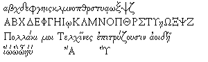
-Greek
-upper and lowercase letters flow well together, looks like handwriting for the lowercase letters, the uppercase letters are very rigid, pronounced serifs, serifs are block like, can scaled down to small sizes easily, thin characters, not any pronouncement between thick and thin lines
What was Happening In History
In the years that Claude Garamond was designing his fonts the Renaissance was happening. He was a Renaissance designer. King Francois I was in power when the typeface Grec Du Roi was created. England’s King Henry VIII marries Anne of Cleves. Thomas Cromwell is beheaded. France is colonizing Canada. The First Account of the Book on the Revolutions by Nicolaus Copernicus is released. Pope Paul III recognized the Jesuit order.
Sources
Typographic Milestones by Allan Haley
Type by Simon Loxley
An A-Z of Type Designers by Neil Macmillan
http://pointlessart.com/education
http://www.infoplease.com
http://www.answers.com/topic/1540
http://www.linotype.com/414/claudegaramond.html
http://www.lostmag.com/issue6/garamond.php
http://www.myfonts.com/fonts/linotype/stempel-garamond/familytree.html
http://www.veer.com/products/typedetail.aspx?image=ADT0003352#about
http://www.citrinitas.com/history_of_viscom/masters.html
http://www.myfonts.com/fonts/linotype/adobe-garamond/
http://desaingrafisindonesia.wordpress.com-history-timeline/