Typographic Terms and some Rules
What are these?
Margin - defines the active area of a page and directs the viewer toward the visual elements
Column - vertical divider of space used to align visual elements
Alley - space between characters
Module - spatial areas that support the textual and visual contents of a design
Gutter - inactive, negative spaes that separate one column from the next to prevent textual and visual elements from colliding into each other
Folio - page number
What are the advantages of a multiple column grid.
They allow for multiple compositional options and it's flexible for other visual elements. It creates a rhythm and movement and allows you to in an organized fashion.
Why is there only one space after a period?
Characters each take up a proportional amount of space.
What is a character in typography?
An individual element of type such as a letter or punctuation mark.
How many characters is optimal for a line length? words per line?
Around 40 characters per line, 70 is too many and 24 is the shortest, or 6 words of 6 characters.
Why is the baseline grid used in design?
To maintain continuity across the pages of a design.
What is a typographic river?
A series of inconsistent word spaces that create distracting open lines running vertically through the justified paragraph.
What does clotheslining or flow line or hangline mean?
Flow lines support vertical columns by dividing a page into horizontal intervals to provide additional alignment points in a grid.
How can you incorporate white space into your designs?
To create movement within the page and create interesting negative space.
What is type color/texture mean?
Type color - refers to the density of typographic elements and their perceived gray value -- the overall feeling of lightness and darkness on the page.
What is x-height, how does it effect type color?
The height of the lowercase letters without ascenders and descenders. Type color is affected by the thickness of the lines or leading.
Tracking?
The typographic technique used to adjust the overall spacing of words, lines, and paragraphs to improve the readable appearance of text.
Kerning?
Why do characters need to be kerned? What are the most common characters that need to be kerned (kerning pairs)?
It is used to adjust the slight distances between letters to avoid character collisions, as well as irregular and unwanted spaces.
Ty, Va, 11, and 19
In justification or H&J terms what do the numbers: minimum, optimum, maximum mean?
minimum - the minimum number of words that come before or after a hyphen.
optimum - allows you to alter word or character spacing within any non-justified paragraphs.
maximum - allows you to adjust the tightness in character spacing. To loosen the spacing enter higher numbers.
What is the optimum space between words?
En space
What are some ways to indicate a new paragraph. Are there any rules?
Indents (the first paragraph of any text does not require an indent because nothing comes before it). An extra line length, typographic devices (bullets, ornaments, symbols), hanging indents
What are the rules associated with hyphenation?
Only used for hyphenated words. No more than 3 times in a row, or six of the eight lines in a paragraph. Never hyphenate a word in a headline
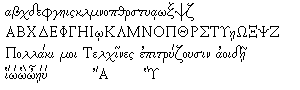
What is a ligurature?
A specially designed character produced by combining two or three letters into one unified form.
What does CMYK and RGB mean?
CMYK - used when preparing for print (cyan, magenta, yellow and black)
RGB - used when preparing for on-screen use (red, green, blue)
What does hanging punctuation mean?
It is a slight indent that is visually distracting. It applies to asterisks, apostrophes, commas, en dashes, hyphens, periods, and quotation marks.
What is the difference between a foot mark and an apostrophe? What is the difference between an inch mark and a quote mark (smart quote)?
Apostrophes and quote marks are angled or curved and opened or closed, whereas inch and foot marks are straight up and down.
What is a hyphen, en dash and em dashes, what are the differences and when are they used?
hyphen - used to link words and breaks syllables of words in text blocks. It is one third of an em rule.
en dash - a punctuation mark used in compound words and to separate items (dates, locations, phone numbers). Also used to separate thoughts when thinking (when used in this way spaces are added before and after the dash).
em dash - a punctuation mark used to separate thoughts within a text. There are no spaces needed before and after, but kerning may be required.
What is a widow and an orphan?
widow - one or two words that are left over at the end of the paragraph and should be avoided
orphan - one or two words from the previous spread that start on a new page, which should be corrected to avoid drawing attention to the isolated elements
Wednesday, December 3, 2008
Helvetica
I didn't realize how much helvetica is used today. In the movie it seemed like it was everywhere. Literally it was everywhere, signs, taxis, in the media, everywhere. The perfectness of it is also eye opening. Many of the designers could not find any way to improve it. I was just amazed every time they showed it on yet another sign or building.
Sunday, November 9, 2008
Claude Garamond

Garamond is a typeface that is widely used today. The namesake of that typeface was equally as popular as the typeface is now when he was around. Starting out as an apprentice punch cutter Claude Garamond quickly made a name for himself in the typography industry. Even though the typeface named for Claude Garamond is not actually based on a design of his own it shows how much of an influence he was. He has his typefaces, typefaces named after him and typeface based on his original typefaces. As a major influence during the 16th century and continued influence all the way to today Claude Garamond has had a major influence in typography and design.
Claude Garamond was born in Paris, France around 1480 or 1490. Rather quickly Garamond entered the industry of typography. He started out as an apprentice punch cutter and printer. Working for Antoine Augereau he specialized in type design as well as punching cutting and printing. His most influential mentor though was Geoffrey Tory. After about a ten years of Tory Garamond’s first font came out. Having been approached by a fellow printer and scholar Robert Estienne to cut types Garamond developed a Roman style font that was first published in Paraphrasis in Elegantiarum Libros Laurentii Vallae by Erasmus. Following the type De Aetna by Aldus Manutius Claude Garamond changed and tweaked it to fit the needs of his commissioner and his own personal tastes. King Francois I saw the typeface and liked it enough to commission a personal typeface. The commission of a typeface from King Francois I signified Claude Garamond’s move from talented designer to hugely popular talented designer. The king asked for a Greek influence type. In 1540 Garamond produced the typeface Grec Du Roi for the King that was exclusively used for the printing of Greek books by Robert Estienne. From this point on Garamond started to work on original typefaces sans commissions and started publishing independently as well.
Working by himself from the year 1545 and on Garamond was independently designing and publishing new typefaces. With the new development of the modern paperback book demand for slimmer typefaces arose. New printing methods were being developed that allowed for smaller books. With smaller books smaller type was needed but it still had to be readable. Italic fonts were the solution that many designers saw to this new format. Italics could be condensed and the design of italics lent itself to slimmer letters which took up less space. Garamond was one of the first to design an italic typeface. While he did not start the trends he used in his design (slanted uppercase letters as well as lowercase letters), his designs were so important that they would later influence many other typefaces of that nature with the same characteristics. Garamond’s new designs were published in his first book Pia et Religiosa Meditatio by David Chambellan. The typefaces in the book were exclusively designed by Garamond. The publishing of his first book started his personal business. He from this point started to sell his typefaces. He was the first person to start a type foundry. In 1530 he started his business of developing and creating typefaces and then selling them to printers. While being a pioneer in the typeface selling business he was not very successful and ended up at the end of his life with little money and little typefaces left.
Claude Garamond died in 1561. He had at one time entertained financial success but by the end of his life he barely owned any of his typefaces. He had been the first designer to create typefaces and sell them but for him the business ventures did not end up working out favorably for him. After his death his widow was forced to sell what little typefaces he still owned as well as some of the punches he still had. As a result his typefaces and punches were distributed around Europe. With the scattering of his typefaces after his death Garamond’s fonts fell out of use for some time. With the decline in the use of his typefaces only the general idea of what characteristics they contained were remembered. The foggy memory of his typefaces that resulted from their decline in popularity is what caused the confusion about his namesake typeface.
For almost two centuries Garamond’s typefaces were out of use and out of the public eye even though they had had great success while he was alive. The 19th century brought in the revival of his typefaces due to private buyers and foundry revivals. The beginning of the revival started with a French printing office looking for a typeface to be exclusively theirs. The French National Printing Office picked a typeface that had been used by the 17th century Royal Printing Office. The typeface they picked, while at the time was under the name of another designer at the time, was later identified to be the work of Garamond. Cardinal Richelieu had supervised the Royal Printing Office and had name the font Caracteres de l’Universite which he used to print his own writings. The French National Printing Office named the actual font creator as Garamond. With this renaming the revival of “Claude Garamond’s” typeface began. Christopher Plantin was major buyer of Garamond’s work and contributed individually to the revival but the real revival happed around the time of World War I. Type foundries all over the world started producing their own versions of his typefaces.
Garamond’s typeface revival was huge. Different versions of his typeface were being produced by every major foundry around the world. The problem that arose was the typeface that was now Claude Garamond’s namesake was not even created by him. The American Type Founders foundry was the first to produce a version of the Garamond typeface. After it was created and had been released the librarian for the foundry, Henry Lewis Bullen, felt as if something was a little wrong with the identification of Claude Garamond as the creator of the typeface that had influenced the new reproductions that were happening. With further research Bullen discovered that the font that the new versions were based on was not even from the 16th century but rather from a more recent period in history. The 16th century was the height of Claude Garamond’s career and seeing that he died in that century he could not have been the designer. With avid cross referencing the real designer was identified as 17th century French designer Jean Jannon. Jannon’s letters while very similar to Garamond’s were more asymmetrical and had a more irregular slope and axis than his. Despite some differences that a discerning eye should have picked up the identification still came out wrong. While there was great confusion of the revivals of Garamond’s font, rather Jean Jannon’s, accurate revivals did surface.
The legacy of Garamond’s typeface starts to get complicated from the discovery of his namesake typeface not being his own design. One of the accurate revival producers wanted to distinguish their font from the now inaccurate Garamond font, so they gave the real revived Garamond font a name that refers to a different designer. G. W. Jones’ Granjon font is one of the true revived versions of Garamond’s typeface but Jones decided to name it after a different French designer, Robert Granjon. Garamond now had a font named after him that he did not actually design nor influence but has a revived version of his actual font that is named after another French designer. There are versions of his font that do in fact contain his name and are really his typeface. Stempel Garamond is one of the accurate versions. It was based off of the Egenolff-Berner specimen sheet that was printed in 1592 and verified as accurate. The Stempel Garamond was released in 1924. The other accurate revision of Garamond’s roman typeface is the Adobe version. Created by Robert Slimbach in 1989 his revival was based on the real Garamond roman typeface. To add to the layers of confusion about Garamond’s font revivals Slimbach’s version of Garamond’s, Adobe Garamond, italic is actually based on designs by Robert Granjon the namesake of a different true revival of the Garamond typeface. Even with the confusion of the accuracy of his typeface revivals and Claude Garamond’s designs have survived six centuries and are still relevant today.
Claude Garamond started as an out as an apprentice punch cutter, became a successful typeface designer until his death, and beyond death has still affected the typography industry. Dying at the age of 81, Garamond was not rich in any way after being the first person to sell his typefaces as a means of income. His business ventures were not successful and ultimately caused his fonts to spread across Europe. This spreading is what caused the confusion of his designs after death. Despite the confusion the revivals of his typefaces are widely used today. In life and death Claude Garamond has had an influential hand in the typography industry.
Fonts designed by Claude Garamond
Revived Vesions :
URW Garamond
ITC Garamond
Adobe Garamond
ITC Garamond (EF)
Garamond 3
Garamond Classico
ITC Garamond Handtooled (EF)
ITC Garamond Italic
Adobe Garamond Italic
EF Garamond No. 5
Adobe Garamond Pro
ITC Garamond Std
Granjon
Original Garamond
Simoncini Garamond
Stempel Garamond
Originals:
Grec Du Roi
Roman Garamond
Adobe Garamond

-Old Style
-scooped serifs, slight diagonal stress, shorter x-height, contrast between thick and thin strokes, stury without being heavy, tail of the capital “q” is distinctive, ear of the “g” is flat
Grec Du Roi
-Greek
-upper and lowercase letters flow well together, looks like handwriting for the lowercase letters, the uppercase letters are very rigid, pronounced serifs, serifs are block like, can scaled down to small sizes easily, thin characters, not any pronouncement between thick and thin lines
What was Happening In History
In the years that Claude Garamond was designing his fonts the Renaissance was happening. He was a Renaissance designer. King Francois I was in power when the typeface Grec Du Roi was created. England’s King Henry VIII marries Anne of Cleves. Thomas Cromwell is beheaded. France is colonizing Canada. The First Account of the Book on the Revolutions by Nicolaus Copernicus is released. Pope Paul III recognized the Jesuit order.
Sources
Typographic Milestones by Allan Haley
Type by Simon Loxley
An A-Z of Type Designers by Neil Macmillan
http://pointlessart.com/education
http://www.infoplease.com
http://www.answers.com/topic/1540
http://www.linotype.com/414/claudegaramond.html
http://www.lostmag.com/issue6/garamond.php
http://www.myfonts.com/fonts/linotype/stempel-garamond/familytree.html
http://www.veer.com/products/typedetail.aspx?image=ADT0003352#about
http://www.citrinitas.com/history_of_viscom/masters.html
http://www.myfonts.com/fonts/linotype/adobe-garamond/
http://desaingrafisindonesia.wordpress.com-history-timeline/
Tuesday, October 14, 2008
Garamond Outline
Opening - start with his life
- Claude Garamond - picture of him
- 1480 or 1490 - have got both as his birth year\
- lived in France
- apprenticeship with printer
Middle - Early successes
-Europe - not just France
Middle - Famous typeface
- Grecs du Roi - (classify - if can find info)
- asked for by King of France
Middle - Other Fonts he created
Middle - His namesake fonts
- confusion about if he designed them (no)
Middle - Modern use of his typefaces
- Garamond - (classify) - Adobe and others
- when was created - what was going on
Closing - end of his life and his impact on font design
- died 1561
Sunday, September 28, 2008
Question about my history
What was the major change in the societies of the Industrial Revolution that brought on the need for more advertising?
Tuesday, September 23, 2008
the industrial revolution: a history
The Industrial Revolution was a time of change. Technology was advancing rapidly and the world was changing. A consumer society was created out of the huge advancements in technology that made producing things easier and faster. Factories were constructed as the world moved away from the home businesses. With the new factories and faster produced products advertising was a must in this newly created society.
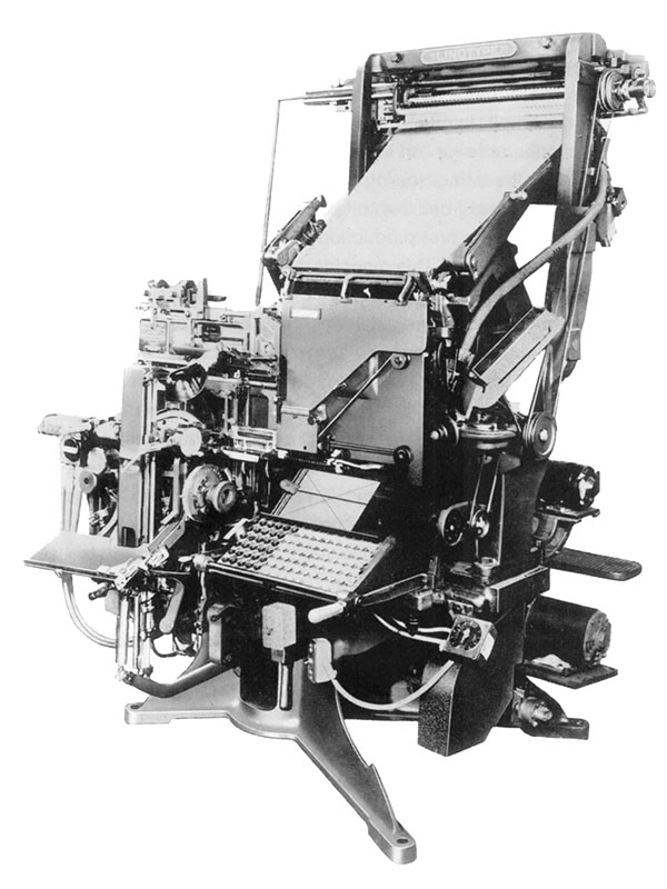
The mechanical side of printing was improved which allowed for speedier printing, line-casting machines, and photo engraving. The line-casting machine allowed for more detail in typesetting. Using points for the measurement of type was also set during the Industrial Revolution.
The creation of new fonts was also sped up because of the advances in technology. More typefaces were developed and adding to existing fonts was easier. Boldface was introduced during this period. With the technology and ease that came with it the experimentation with typefaces began. With the continued experimentation serifs were edited out and disappeared in the typefaces of the time.
William Caslon created the first sans serif font: English Egyptian. The trend of sans serif fonts was called grotesque, a name still used today, because it was so unusual compared to the other fonts of previous eras.
 With the Industrial Revolution also came advances in lithography. Created by
  Alois Senefelder lithography saw refinements that sped up the print speeds dramatically. With the new commercial society the need for posters to advertise things became widespread. Along with the advancements in poster design and creation came an advancement that made correcting mistakes a lot easier. The monotype character caster made it possible to make corrections at the character level rather than having to re-do the whole page.


Sources:
the fundamentals of typography
http://www.britannica.com/EBchecked/topic/1032864/graphic-design#default
Tuesday, September 16, 2008
The Fundamentals of Type Definitions...
Absolute Measurement- measurements of fixed values.
Relative Measurement- measurements that have no absolute size and are linked to type size.
Points- a unit of measurement for specifying type size where 72 points equal 1 inch.
Picas- a unit of measurement for specifying line lengths where 12 picas equal 1 point.
x-height- the height of a lowercase "x" of a given typeface.
Em- unit of measurement derived from the width of the square body of the cast upper case "M". equals the size of a given type.
En- unit of measurement equal to half of 1 em.
Hyphens- one third of an em rule used to link words.
Dashes- short horizontal rules that serve various specific functions such as ens and ems. ( Look up)
Alignments- refer to the position of type within a text block in both horizontal and vertical planes.
Justification- horizontal allows the appearance of rivers of white space to appear; vertical forces the lines to distribute throughout the text block.
Flush Left- text tight and aligned to the left margin and ending ragged on the right.
Flush Right- text tight and aligned to the right margin and ending ragged on the left.
Letterspacing- adds space between letterforms to open up text.
Kerning- the removal of unwanted space between letters.
Tracking- the adjustable amount of space between letters.
Word Spacing- adjusts the space between words.
Widow- a lone word at the end of a paragraph.
Orphan- final one or two lines of a paragraph separated from the main paragraph to form a new column.
Leading- the space between lines of type measured from baseline to baseline. It's expressed in points.
Indent- when text is moved in from the margins by a specified amount.
Fist Line Indent- text is indented form the left margin in the first line of the second and subsequent paragraphs.
Hanging Indent- indention from the left or right margin which affects several text lines expect the first line.
Tuesday, September 9, 2008
Adrian Frutiger's Univers
 At the age of 16 Adrian Frutiger worked as an apprentice for a compositor for a printer near his hometown of Interlaken, Switzerland. Frutiger was born in 1928 and is one of the most prominent typeface designers around. With the early start to his career that he got from being an apprentice his moved on from that experience to attending the Zurich School of Arts and Crafts. One of the first jobs that he acquired after attending school in Zurich was a typefoundry job in Paris. He worked on moving typefaces used with traditional printing methods to the new phototypesetting technology that had been developed. At the same time Frutiger started designing original typefaces. Although he is most notably known for his Univers font Frutiger's first commercial font was President. Along with his famous Univers font he has created 17 typefaces.
Univers is Adrian Frutiger's most notable typeface. He created a typeface that allowed for variations of different weights all within the same family. A unique number system is also used to identify the different variations within the typeface. Right now the Univers type family consists of 44 faces, with 16 uniquely numbered weight, width, position combinations. 20 fonts have oblique positions. All of these different variations can be seen in the Univers grid. The grid shows the variations and how each variation differs slightly to get to the next.
 Who is Adrian Frutiger? He is the person who created one the most uniform and versatile typefaces of his and our generation.
Sources:
Wikipedia Univers
typophile.com
artandculture.com
Wikipedia Adrian_Frutiger
John Baskerville and his typeface
 John Baskerville was a type designer and a printer. He was also a stone cutter and a master at English writing. Born in a village called Wolverley in Worcestershire he was a printer in Birmingham, England. He had established himself as an accomplished writer and engraver of headstones. He excelled in the technique of japanning and with the money he had made was able to start the printing business that would lead him to the recognition he has today. While he didn't always make the most money at times and often lost money on his ventures in the printing business those ventures contributed greatly to the printing industry. His attention to detailed perfection produced exquisite works of typefaces and books. Even though an atheist Baskerville printed a bible for Cambridge University. With the immaculate perfection that he had achieved with his printing came the disdain of his competitors. The undeserved harsh criticism he received soon pushed his designs out of favor with the business. Even though he was de-popularized his namesake font found its way to our time. He created a very consistent font that he thought improved upon the work of his rival William Caslon. The serif typeface that he created was simple and refined showing his taste of perfection. The serifs are what set his typeface apart from his competition. Most notably the tail of the uppercase Q where he adorned it with a distinctive tail. The typeface fell out of use like Baskerville himself did but was revived in 1917 for the Harvard University Press as well as for the British Monotype Company. Baskerville's picture perfect typeface is a rarity among typefaces that were developed in world where everything was done by hand with out the technology that we have today. So who was John Baskerville.
 He was an underappreciated perfectionist who found relevance well after death.
Sources:
myfonts.com
Wikipedia John_Baskerville
Wikipedia Baskerville
infoplease.com
Tuesday, September 2, 2008
The Grid

 The Grid. Why do graphic designers always come back to it? The most obvious reason that I see is for structure. In a world where we design based on our own thoughts and intuitions having some thing to give you parameters is always good. We're artists, sometimes we will get carried away, over design something, or do something that just doesn't make any sense, the grid helps to conteract those things. Within it there is a lot of freedom...just structured freedom.

As before mentioned the grid works for you in structuring the page. The grid lets you organize the elements you want to include in your design in an effective way that will be easy for the reader to understand. The grid is also very versatile. You can create a grid simple or complex that can meet any possible need that you could think of.

Sources:
Grid Blog - Todd Roeth
Flickr photos of Grid book
Wikipedia on Grids
Tuesday, August 26, 2008
Peretz Rosenbaum...Paul Rand

Who is Paul Rand? Paul Rand was Peretz Rosenbaum. He used his given name early in his design career but decided he needed to camouflage his Jewish background with a name change. So he, from Peretz became Paul and from Rosenbaum became Rand. While widely known for his design in the corporate world Rand was actually a successful page design for magazines. He amassed his reputation by doing this. He worked for Esquire and did a very notable cover for 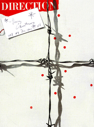 Direction magazine as well as working for Apparel Arts. As Paul Rand’s reputation grew his name was carried along with it. His name now carried an immense amount of weight in the design world. It is with this name, this brand of himself that he created that he carried himself into the corporate world of the design industry.
“He almost singlehandedly convinced business that design was an effective tool.”
--Louis Danziger
Rand came into the advertising world with a unique style. He spent fourteen years in the ad business and during that time made a mark for designers in the advertising world. The companies he worked with include IBM, ABC, UPS as well as others. The work he did with those powerhouses in their respective fields is still around today. You still are able to see the work that he did most of it still unchanged and original.
Later in his life he moved away from the fast and changing world of advertising to Weston, Connecticut where he lived with his wife.
So who is Paul Rand?
Paul Rand was a pioneer.
Sources: Paul_Rand on wikipedia; paul rand.com; artandculture.com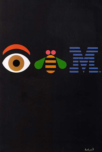


Subscribe to:
Posts (Atom)