Thursday, February 12, 2009
type ii #5
I found Stefan Sagmeister's video pretty interesting. He talked a lot about other people...I wish he would have talked about his stuff more because it is good. The subway signs were interesting. I wouldn't pay that much attention to a sign...in a subway...maybe I will...if I go to a subway.

type ii #4
Ten commandments...from Type Heresy
1. Thou shalt not apply more than three typefaces in a document.
2. Thou shalt lay headlines large and at the top of a page.
3. Thou shalt employ no other type size than 8pt to 10pt for body copy.
4. Remember that a typeface that is not legible is not truly a typeface.
5. Honour thy kerning, so that white space becomes visually equalized between characters.
6. Thou shalt lay stress discreetly upon elements within text.
7. Thou shalt not use only capitals when setting vast body copy.
8. Thou shalt always align letters and words on a baseline.
9. Thou shalt use flush-left, ragged-right alignment.
10. Thou shalt not make lines too short or too long.
Going to Hell...
1. Break the letters imposed by the use of only three typefaces.
2. Let thine eyes be seduced by the hierarchy of type.
3. Do not forsake smaller or bigger sizes.
4. Be seduced into trying new and expressive typefaces.
5. Treat kerning and tracking with total irreverence.
6. Entice the reader to sample the delights of your text.
7. Do not forgo the liberal use of capitals within your text.
8. The Lord designed letterforms to stand side by side, but there is no harm in their being lured away from one another.
9. Yield to the temptation to align text in unusual ways.
10. Lure the reader down unfamiliar paths.
1. Thou shalt not apply more than three typefaces in a document.
2. Thou shalt lay headlines large and at the top of a page.
3. Thou shalt employ no other type size than 8pt to 10pt for body copy.
4. Remember that a typeface that is not legible is not truly a typeface.
5. Honour thy kerning, so that white space becomes visually equalized between characters.
6. Thou shalt lay stress discreetly upon elements within text.
7. Thou shalt not use only capitals when setting vast body copy.
8. Thou shalt always align letters and words on a baseline.
9. Thou shalt use flush-left, ragged-right alignment.
10. Thou shalt not make lines too short or too long.
Going to Hell...
1. Break the letters imposed by the use of only three typefaces.
2. Let thine eyes be seduced by the hierarchy of type.
3. Do not forsake smaller or bigger sizes.
4. Be seduced into trying new and expressive typefaces.
5. Treat kerning and tracking with total irreverence.
6. Entice the reader to sample the delights of your text.
7. Do not forgo the liberal use of capitals within your text.
8. The Lord designed letterforms to stand side by side, but there is no harm in their being lured away from one another.
9. Yield to the temptation to align text in unusual ways.
10. Lure the reader down unfamiliar paths.
Tuesday, February 3, 2009
type ii #3
After watching the videos what took from it were some nice ideas about how to reach people through your work. He, in the first video mentioned participation. Not necessarily interactive but something to get the viewers mind to work, so the viewer has a "personal discovery".
-"Be inspired.
Tell stories.
And leave things out."
In the third video he talked about when you are designing and trying to tell the story you've come up with make sure it is something that everyone can relate to. You have to learn how to tell stories and to do that you have to have practice...by doing it. Try writing a song or a short story of your own just for practice.
-"Be inspired.
Tell stories.
And leave things out."
In the third video he talked about when you are designing and trying to tell the story you've come up with make sure it is something that everyone can relate to. You have to learn how to tell stories and to do that you have to have practice...by doing it. Try writing a song or a short story of your own just for practice.
Monday, February 2, 2009
type ii #2

Bruce Mau is from Canada. He studied at the Ontario College of Art and Design. He is the founder of Institute Without Boundaries and the creative director of Bruce Mau Design. He didn't graduate from the Ontario school but left early to join the Fifty Fingers design group. He designed the Zone 1/2 and then started his own design studio and kept designing the Zone books. As of 2007, Mau was in residence at The School of the Art Institute of Chicago, in the Architecture, Interior Architecture, and Design Objects Department.
Make mistakes faster.This isn’t my idea -- I borrowed it. I think it belongs to Andy Grove.
Once you make a mistake you know it is one and can try to improve on it, fix it or just give up on it. But you have to make the mistake to figure out what to do with the idea. If you don't try all those ideas that you think could be a mistake you'll never know and it could've turned out to be a success.
Tuesday, January 20, 2009
graphics reading 2
Everyone realizes the client is important...or you wouldn't have a job in the first place. What I didn't pay enough intention to was the fact that ideas for the project can stem directly from interacting with that client. If you learn as much as possible you can find insight and come up with a great idea that relates the to the client because that's what it was derived from.
Another part of the reading I thought was important was the part about being strong. In that part there was commentary about when your ideas get rejected. I have fallen in love with many of my designs only to have them shot down and buried with no means of revival. It sucked but I had to keep going like the reading said. In the end its not about what you thought was perfect, it's about the joint agreement of what the you and the client decided was best.
Another part of the reading I thought was important was the part about being strong. In that part there was commentary about when your ideas get rejected. I have fallen in love with many of my designs only to have them shot down and buried with no means of revival. It sucked but I had to keep going like the reading said. In the end its not about what you thought was perfect, it's about the joint agreement of what the you and the client decided was best.
Monday, January 19, 2009
graphics reading 1
So much goes into what we interpret from a symbol. It depends on our culture in what context that symbol in is. Even word can mean other things in different contexts. when creating a logo you have to imagine every way that someone can interpret it, every way that someone can look at it differently. After brainstorming and looking at your target audience you also have to look at the audience you aren't trying to reach so that you don't offend them as well or convey the wrong message.
What is the definition of semiotics and how does it apply to creating logos?
What is the definition of semiotics and how does it apply to creating logos?
Sunday, January 18, 2009
type ii




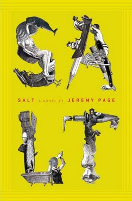
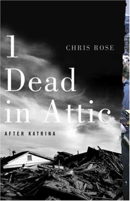

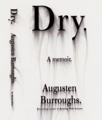
?
?
?
?
kyle kolker
?
?
joya mizeli
?
john gall
chip kidd
Who is Chip Kidd...
He is a book cover designer.
Why is he important...
He has designed over 1000 book covers. He is a graphic designer turned author and he received the 2007 Cooper-Hewitt National Design Award. He creates unique interesting book designs that seperate themselves from the rest of the book world
He is very good at what he does.
Who is John Gall...
He is the art director for Vintage and Anchor books. He too is a book cover designer.
Why is he important...
He is the art directer the oversees about 200 books a year being designed and publishes. He is a leader in his profession and he is very good at what he does as well.
Definitions...
series - a sequence of books with similar traits or characteristics
sequence - a ordered list of things (i.e. books) that follow one another
sign - a symbol that represents something to inform or communicate with the viewer
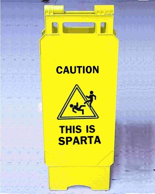 example...this sign is telling we are in sparta...a pedestrian crossing sign or deer crossing sign
index - a sensory feature that correlates to or implies something else
 example... these storm clouds are an index of a storm to come...
smoke is index of a fire
symbol - a picture that represents something or a word that represents some other word
 example... this picture is a symbol for peace...
the six point star is a symbol of Judaism
Subscribe to:
Posts (Atom)