Everyone realizes the client is important...or you wouldn't have a job in the first place. What I didn't pay enough intention to was the fact that ideas for the project can stem directly from interacting with that client. If you learn as much as possible you can find insight and come up with a great idea that relates the to the client because that's what it was derived from.
Another part of the reading I thought was important was the part about being strong. In that part there was commentary about when your ideas get rejected. I have fallen in love with many of my designs only to have them shot down and buried with no means of revival. It sucked but I had to keep going like the reading said. In the end its not about what you thought was perfect, it's about the joint agreement of what the you and the client decided was best.
Tuesday, January 20, 2009
Monday, January 19, 2009
graphics reading 1
So much goes into what we interpret from a symbol. It depends on our culture in what context that symbol in is. Even word can mean other things in different contexts. when creating a logo you have to imagine every way that someone can interpret it, every way that someone can look at it differently. After brainstorming and looking at your target audience you also have to look at the audience you aren't trying to reach so that you don't offend them as well or convey the wrong message.
What is the definition of semiotics and how does it apply to creating logos?
What is the definition of semiotics and how does it apply to creating logos?
Sunday, January 18, 2009
type ii


?
?
?
?
kyle kolker
?
?
joya mizeli
?
john gall
chip kidd
Who is Chip Kidd...
He is a book cover designer.
Why is he important...
He has designed over 1000 book covers. He is a graphic designer turned author and he received the 2007 Cooper-Hewitt National Design Award. He creates unique interesting book designs that seperate themselves from the rest of the book world
He is very good at what he does.
Who is John Gall...
He is the art director for Vintage and Anchor books. He too is a book cover designer.
Why is he important...
He is the art directer the oversees about 200 books a year being designed and publishes. He is a leader in his profession and he is very good at what he does as well.
Definitions...
series - a sequence of books with similar traits or characteristics
sequence - a ordered list of things (i.e. books) that follow one another
sign - a symbol that represents something to inform or communicate with the viewer
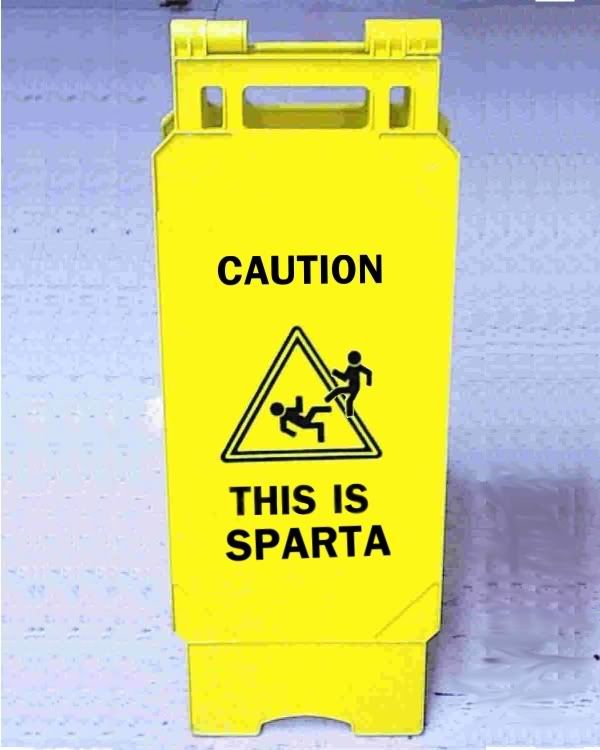 example...this sign is telling we are in sparta...a pedestrian crossing sign or deer crossing sign
index - a sensory feature that correlates to or implies something else
 example... these storm clouds are an index of a storm to come...
smoke is index of a fire
symbol - a picture that represents something or a word that represents some other word
 example... this picture is a symbol for peace...
the six point star is a symbol of Judaism
Wednesday, December 3, 2008
Those questions we had to answer...
Typographic Terms and some Rules
What are these?
Margin - defines the active area of a page and directs the viewer toward the visual elements
Column - vertical divider of space used to align visual elements
Alley - space between characters
Module - spatial areas that support the textual and visual contents of a design
Gutter - inactive, negative spaes that separate one column from the next to prevent textual and visual elements from colliding into each other
Folio - page number
What are the advantages of a multiple column grid.
They allow for multiple compositional options and it's flexible for other visual elements. It creates a rhythm and movement and allows you to in an organized fashion.
Why is there only one space after a period?
Characters each take up a proportional amount of space.
What is a character in typography?
An individual element of type such as a letter or punctuation mark.
How many characters is optimal for a line length? words per line?
Around 40 characters per line, 70 is too many and 24 is the shortest, or 6 words of 6 characters.
Why is the baseline grid used in design?
To maintain continuity across the pages of a design.
What is a typographic river?
A series of inconsistent word spaces that create distracting open lines running vertically through the justified paragraph.
What does clotheslining or flow line or hangline mean?
Flow lines support vertical columns by dividing a page into horizontal intervals to provide additional alignment points in a grid.
How can you incorporate white space into your designs?
To create movement within the page and create interesting negative space.
What is type color/texture mean?
Type color - refers to the density of typographic elements and their perceived gray value -- the overall feeling of lightness and darkness on the page.
What is x-height, how does it effect type color?
The height of the lowercase letters without ascenders and descenders. Type color is affected by the thickness of the lines or leading.
Tracking?
The typographic technique used to adjust the overall spacing of words, lines, and paragraphs to improve the readable appearance of text.
Kerning?
Why do characters need to be kerned? What are the most common characters that need to be kerned (kerning pairs)?
It is used to adjust the slight distances between letters to avoid character collisions, as well as irregular and unwanted spaces.
Ty, Va, 11, and 19
In justification or H&J terms what do the numbers: minimum, optimum, maximum mean?
minimum - the minimum number of words that come before or after a hyphen.
optimum - allows you to alter word or character spacing within any non-justified paragraphs.
maximum - allows you to adjust the tightness in character spacing. To loosen the spacing enter higher numbers.
What is the optimum space between words?
En space
What are some ways to indicate a new paragraph. Are there any rules?
Indents (the first paragraph of any text does not require an indent because nothing comes before it). An extra line length, typographic devices (bullets, ornaments, symbols), hanging indents
What are the rules associated with hyphenation?
Only used for hyphenated words. No more than 3 times in a row, or six of the eight lines in a paragraph. Never hyphenate a word in a headline
What is a ligurature?
A specially designed character produced by combining two or three letters into one unified form.
What does CMYK and RGB mean?
CMYK - used when preparing for print (cyan, magenta, yellow and black)
RGB - used when preparing for on-screen use (red, green, blue)
What does hanging punctuation mean?
It is a slight indent that is visually distracting. It applies to asterisks, apostrophes, commas, en dashes, hyphens, periods, and quotation marks.
What is the difference between a foot mark and an apostrophe? What is the difference between an inch mark and a quote mark (smart quote)?
Apostrophes and quote marks are angled or curved and opened or closed, whereas inch and foot marks are straight up and down.
What is a hyphen, en dash and em dashes, what are the differences and when are they used?
hyphen - used to link words and breaks syllables of words in text blocks. It is one third of an em rule.
en dash - a punctuation mark used in compound words and to separate items (dates, locations, phone numbers). Also used to separate thoughts when thinking (when used in this way spaces are added before and after the dash).
em dash - a punctuation mark used to separate thoughts within a text. There are no spaces needed before and after, but kerning may be required.
What is a widow and an orphan?
widow - one or two words that are left over at the end of the paragraph and should be avoided
orphan - one or two words from the previous spread that start on a new page, which should be corrected to avoid drawing attention to the isolated elements
Helvetica
I didn't realize how much helvetica is used today. In the movie it seemed like it was everywhere. Literally it was everywhere, signs, taxis, in the media, everywhere. The perfectness of it is also eye opening. Many of the designers could not find any way to improve it. I was just amazed every time they showed it on yet another sign or building.
Sunday, November 9, 2008
Claude Garamond

Garamond is a typeface that is widely used today. The namesake of that typeface was equally as popular as the typeface is now when he was around. Starting out as an apprentice punch cutter Claude Garamond quickly made a name for himself in the typography industry. Even though the typeface named for Claude Garamond is not actually based on a design of his own it shows how much of an influence he was. He has his typefaces, typefaces named after him and typeface based on his original typefaces. As a major influence during the 16th century and continued influence all the way to today Claude Garamond has had a major influence in typography and design.
Claude Garamond was born in Paris, France around 1480 or 1490. Rather quickly Garamond entered the industry of typography. He started out as an apprentice punch cutter and printer. Working for Antoine Augereau he specialized in type design as well as punching cutting and printing. His most influential mentor though was Geoffrey Tory. After about a ten years of Tory Garamond’s first font came out. Having been approached by a fellow printer and scholar Robert Estienne to cut types Garamond developed a Roman style font that was first published in Paraphrasis in Elegantiarum Libros Laurentii Vallae by Erasmus. Following the type De Aetna by Aldus Manutius Claude Garamond changed and tweaked it to fit the needs of his commissioner and his own personal tastes. King Francois I saw the typeface and liked it enough to commission a personal typeface. The commission of a typeface from King Francois I signified Claude Garamond’s move from talented designer to hugely popular talented designer. The king asked for a Greek influence type. In 1540 Garamond produced the typeface Grec Du Roi for the King that was exclusively used for the printing of Greek books by Robert Estienne. From this point on Garamond started to work on original typefaces sans commissions and started publishing independently as well.
Working by himself from the year 1545 and on Garamond was independently designing and publishing new typefaces. With the new development of the modern paperback book demand for slimmer typefaces arose. New printing methods were being developed that allowed for smaller books. With smaller books smaller type was needed but it still had to be readable. Italic fonts were the solution that many designers saw to this new format. Italics could be condensed and the design of italics lent itself to slimmer letters which took up less space. Garamond was one of the first to design an italic typeface. While he did not start the trends he used in his design (slanted uppercase letters as well as lowercase letters), his designs were so important that they would later influence many other typefaces of that nature with the same characteristics. Garamond’s new designs were published in his first book Pia et Religiosa Meditatio by David Chambellan. The typefaces in the book were exclusively designed by Garamond. The publishing of his first book started his personal business. He from this point started to sell his typefaces. He was the first person to start a type foundry. In 1530 he started his business of developing and creating typefaces and then selling them to printers. While being a pioneer in the typeface selling business he was not very successful and ended up at the end of his life with little money and little typefaces left.
Claude Garamond died in 1561. He had at one time entertained financial success but by the end of his life he barely owned any of his typefaces. He had been the first designer to create typefaces and sell them but for him the business ventures did not end up working out favorably for him. After his death his widow was forced to sell what little typefaces he still owned as well as some of the punches he still had. As a result his typefaces and punches were distributed around Europe. With the scattering of his typefaces after his death Garamond’s fonts fell out of use for some time. With the decline in the use of his typefaces only the general idea of what characteristics they contained were remembered. The foggy memory of his typefaces that resulted from their decline in popularity is what caused the confusion about his namesake typeface.
For almost two centuries Garamond’s typefaces were out of use and out of the public eye even though they had had great success while he was alive. The 19th century brought in the revival of his typefaces due to private buyers and foundry revivals. The beginning of the revival started with a French printing office looking for a typeface to be exclusively theirs. The French National Printing Office picked a typeface that had been used by the 17th century Royal Printing Office. The typeface they picked, while at the time was under the name of another designer at the time, was later identified to be the work of Garamond. Cardinal Richelieu had supervised the Royal Printing Office and had name the font Caracteres de l’Universite which he used to print his own writings. The French National Printing Office named the actual font creator as Garamond. With this renaming the revival of “Claude Garamond’s” typeface began. Christopher Plantin was major buyer of Garamond’s work and contributed individually to the revival but the real revival happed around the time of World War I. Type foundries all over the world started producing their own versions of his typefaces.
Garamond’s typeface revival was huge. Different versions of his typeface were being produced by every major foundry around the world. The problem that arose was the typeface that was now Claude Garamond’s namesake was not even created by him. The American Type Founders foundry was the first to produce a version of the Garamond typeface. After it was created and had been released the librarian for the foundry, Henry Lewis Bullen, felt as if something was a little wrong with the identification of Claude Garamond as the creator of the typeface that had influenced the new reproductions that were happening. With further research Bullen discovered that the font that the new versions were based on was not even from the 16th century but rather from a more recent period in history. The 16th century was the height of Claude Garamond’s career and seeing that he died in that century he could not have been the designer. With avid cross referencing the real designer was identified as 17th century French designer Jean Jannon. Jannon’s letters while very similar to Garamond’s were more asymmetrical and had a more irregular slope and axis than his. Despite some differences that a discerning eye should have picked up the identification still came out wrong. While there was great confusion of the revivals of Garamond’s font, rather Jean Jannon’s, accurate revivals did surface.
The legacy of Garamond’s typeface starts to get complicated from the discovery of his namesake typeface not being his own design. One of the accurate revival producers wanted to distinguish their font from the now inaccurate Garamond font, so they gave the real revived Garamond font a name that refers to a different designer. G. W. Jones’ Granjon font is one of the true revived versions of Garamond’s typeface but Jones decided to name it after a different French designer, Robert Granjon. Garamond now had a font named after him that he did not actually design nor influence but has a revived version of his actual font that is named after another French designer. There are versions of his font that do in fact contain his name and are really his typeface. Stempel Garamond is one of the accurate versions. It was based off of the Egenolff-Berner specimen sheet that was printed in 1592 and verified as accurate. The Stempel Garamond was released in 1924. The other accurate revision of Garamond’s roman typeface is the Adobe version. Created by Robert Slimbach in 1989 his revival was based on the real Garamond roman typeface. To add to the layers of confusion about Garamond’s font revivals Slimbach’s version of Garamond’s, Adobe Garamond, italic is actually based on designs by Robert Granjon the namesake of a different true revival of the Garamond typeface. Even with the confusion of the accuracy of his typeface revivals and Claude Garamond’s designs have survived six centuries and are still relevant today.
Claude Garamond started as an out as an apprentice punch cutter, became a successful typeface designer until his death, and beyond death has still affected the typography industry. Dying at the age of 81, Garamond was not rich in any way after being the first person to sell his typefaces as a means of income. His business ventures were not successful and ultimately caused his fonts to spread across Europe. This spreading is what caused the confusion of his designs after death. Despite the confusion the revivals of his typefaces are widely used today. In life and death Claude Garamond has had an influential hand in the typography industry.
Fonts designed by Claude Garamond
Revived Vesions :
URW Garamond
ITC Garamond
Adobe Garamond
ITC Garamond (EF)
Garamond 3
Garamond Classico
ITC Garamond Handtooled (EF)
ITC Garamond Italic
Adobe Garamond Italic
EF Garamond No. 5
Adobe Garamond Pro
ITC Garamond Std
Granjon
Original Garamond
Simoncini Garamond
Stempel Garamond
Originals:
Grec Du Roi
Roman Garamond
Adobe Garamond

-Old Style
-scooped serifs, slight diagonal stress, shorter x-height, contrast between thick and thin strokes, stury without being heavy, tail of the capital “q” is distinctive, ear of the “g” is flat
Grec Du Roi
-Greek
-upper and lowercase letters flow well together, looks like handwriting for the lowercase letters, the uppercase letters are very rigid, pronounced serifs, serifs are block like, can scaled down to small sizes easily, thin characters, not any pronouncement between thick and thin lines
What was Happening In History
In the years that Claude Garamond was designing his fonts the Renaissance was happening. He was a Renaissance designer. King Francois I was in power when the typeface Grec Du Roi was created. England’s King Henry VIII marries Anne of Cleves. Thomas Cromwell is beheaded. France is colonizing Canada. The First Account of the Book on the Revolutions by Nicolaus Copernicus is released. Pope Paul III recognized the Jesuit order.
Sources
Typographic Milestones by Allan Haley
Type by Simon Loxley
An A-Z of Type Designers by Neil Macmillan
http://pointlessart.com/education
http://www.infoplease.com
http://www.answers.com/topic/1540
http://www.linotype.com/414/claudegaramond.html
http://www.lostmag.com/issue6/garamond.php
http://www.myfonts.com/fonts/linotype/stempel-garamond/familytree.html
http://www.veer.com/products/typedetail.aspx?image=ADT0003352#about
http://www.citrinitas.com/history_of_viscom/masters.html
http://www.myfonts.com/fonts/linotype/adobe-garamond/
http://desaingrafisindonesia.wordpress.com-history-timeline/
Tuesday, October 14, 2008
Garamond Outline
Opening - start with his life
- Claude Garamond - picture of him
- 1480 or 1490 - have got both as his birth year\
- lived in France
- apprenticeship with printer
Middle - Early successes
-Europe - not just France
Middle - Famous typeface
- Grecs du Roi - (classify - if can find info)
- asked for by King of France
Middle - Other Fonts he created
Middle - His namesake fonts
- confusion about if he designed them (no)
Middle - Modern use of his typefaces
- Garamond - (classify) - Adobe and others
- when was created - what was going on
Closing - end of his life and his impact on font design
- died 1561
Subscribe to:
Posts (Atom)